 |
| Tech With Pratik |
If you are looking for a complete look at what build is in which Insider ring – head on over to Flight Hub. You can also check out the rest of our documentation here
including a complete list of new features and updates that have gone
out as part of Insider flights for the current development cycle (which
currently is 19H1).
What’s new in Build 18282
New default wallpaper
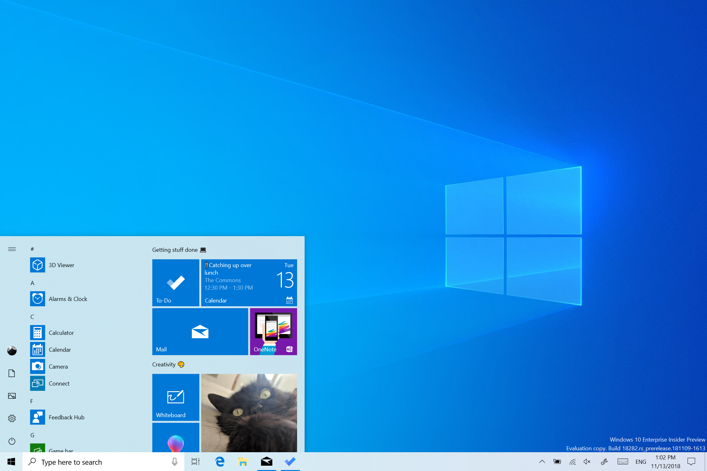
- There's a new Windows 10 wallpaper that matches the light theme, as showcased above.
Windows Light Theme

Ever since we introduced the ability to choose
between light and dark in Windows 10, we’ve heard feedback asking for a
truer separation between the two options. When you select Light under
Settings > Personalization > Colors, the expectation is that the
system color would be lighter too. And it didn’t do that before – the
taskbar and many other things stayed dark. Now, if you choose Light
under Settings > Personalization > Colors, all system UI will now be light. This includes the taskbar, Start menu, Action Center, touch keyboard, and more.
When you update to this build, your system
color won’t automatically change to the new light system color. This is
because we want everything to be exactly as you left it before you did
the update. We’re leaving the choice up to you! If you had light mode
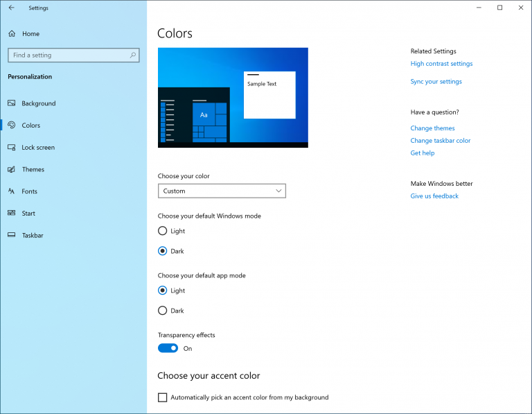
selected prior to the update, this is what Color Settings will look like
after updating:

Bringing window snip to your modern snipping experience
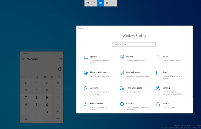
- Today are really excited to announce that window snip is on its way to Insiders too! Start your snip via your preferred entry point (WIN + Shift + S, Print Screen (if you've enabled it), directly from within Snip & Sketch, etc.), and select the window snip option at the top, and snip away! That selection will be remembered the next time you start a snip.
Improving your modern printing experience
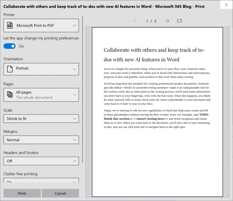
- First and foremost, the modern print dialog now supports light theme!
- Second: In order to improve clarity, we've updated a number of the printing options to now include icons to help you easily and quickly identify the one you're looking for. We've also added a line of description to some of the dropdown settings. This can be seen in the Pages example below, and in other settings if you click More Settings at the bottom of the print dialog.
- Finally: If you have a long printer name, it will now wrap rather than being cut off.
New music control

Microsoft is building a music applet into the System Trays volume control flyout, which looks fantastic and is a fitting replacement for the old music control that uses Windows 8 design. While this isn't in Insider builds just yet, it shouldn't be long before Microsoft is testing it in the Fast ring. It should definitely be showing up in 2019 officially.
More fluent design

We should also expect to see drop-shadow effects show up in more areas too, including behind context menus. This gives additional depth to the UI, which looks great when in use. The combination of reveal, acrylic and shadow are all being used in the name of making Windows 10 prettier, which is a good thing.
Source :- www.windowscentral.com


